

The Problem
Weak relationships between team leads and their team results in poor communication, trust issues, and an unenjoyable workplace culture.
My Solution
Enhance employee feedback with DEI and workplace culture surveys. Offer data analysis and actionable steps based on the feedback.

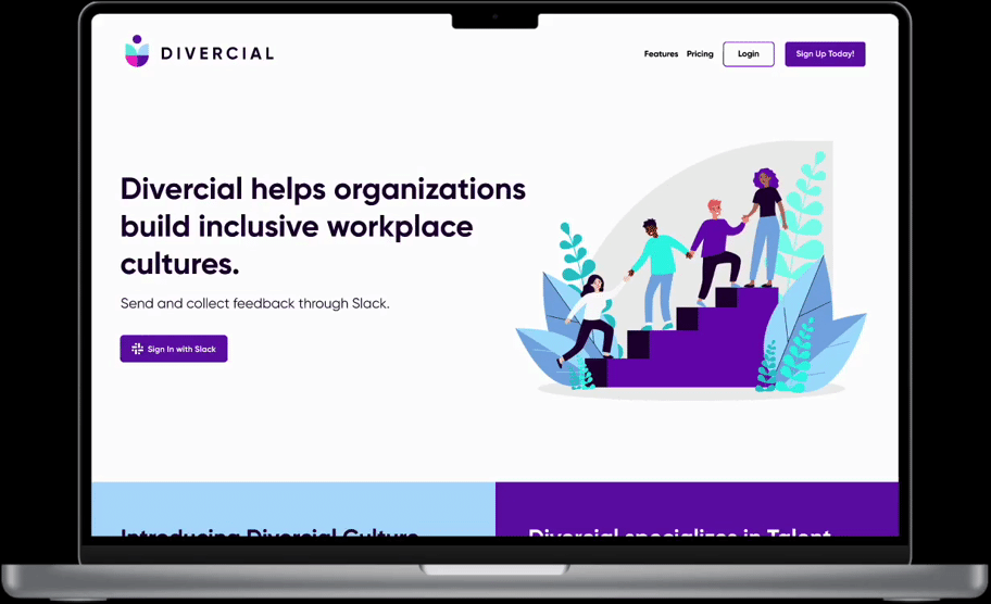
The re-designed landing page
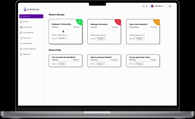
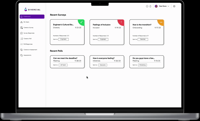
The new Culture CoPilot Dashboard

Divercial helps define a workplace's culture
Workplace culture is often hard to define, particularly in a post-COVID world with hybrid and multinational teams. Team leaders may struggle to understand their employees' identities, work styles, and cultural influences.
While companies commit to hiring diverse employees, top leadership at the average American company continues to be predominantly male and white. As a result, the services of companies such as Divercial (my client) become important in understanding company culture through the lens of DEI (diversity, equity, and inclusion).
Where did we come in?
My team developed the Culture Copilot, which included a new landing page, login flow, Copilot dashboard, and tools like surveys and polls to assess employee sentiments about their company. The platform utilizes generative AI to interpret feedback data and suggest actionable solutions to team leaders.
How the CoPilot works:
.png)
1. Team lead finds template
🕵🏼♀️
2. Survey sent to Employees
📝
3. Review data + action steps
🧐
4. Implement
changes!
🏆
How did we make this? It starts with the competition
I began our design research through a competitive analysis to understand the landscape of workplace culture assessment.
-
The first subset of competitors we researched provided the same services, so ways to assess company culture through data collection.
-
The second subset were companies that focused on native third party app integration into Slack. Divercial wanted to link their platform with Slack so managers could create surveys on CoPilot dashboard and send them through Slack.
.png)
-
Surveys allow qualitative and quantitative feedback
-
Data visualization varies by question
-
Survey templates can be customized
-
Surveys assess various facets of workplace culture.
Subset 1 Strengths
From CultureAmp's Website

From Polly's Website

Subset 2 Strengths
-
Ability to schedule surveys
-
Can post survey to Slack directly from website
-
Live preview of how survey will look on Slack as you're creating it
-
Can change visibility of survey
-
Merge best components of both subsets
-
Incorporate its unique competitive advantage: data interpretation and recommendations
The goal for Divercial
Beta building blocks
I also had some building blocks provided by Divercial - a beta website and beta CoPilot product. My heuristic evaluation, which assesses site usability, noted issues that would prevent team leads from properly administering and interpreting survey results.
Data visualization always shows up as the same pie chart graph, which didn't correspond with many of the survey types.
Every survey question provided the same 5 answer choices (scale from strongly disagree to strongly agree). These options wouldn't always make sense given the question.
(What Divercial gave us)

Establishing our priorities
There were so many ideas and features I wanted to implement. But with only 3 weeks to design, I made a prioritization (MSCW) chart to determine what the most essential deliverables of this sprint would be.
.png)
-
Dashboard with ability to create and send surveys
-
Different forms of data visualization
-
Design team lead view (primary user)
-
Ability to customize titles, descriptions, and questions
-
Elements that match Divercial's brand (color, font, tone)
-
Re-imagined final report of data and results
-
Design what the secondary user (employee) sees
-
Live preview of survey in dashboard
-
User Management System (how admin access is granted, for example)
-
Where payment options fit in user journey
To lead is to empathize
Once I established the primary user, I interviewed 9 team leaders that were invested in their company's culture.
Here's what we found:
Our initial design for the CoPilot
Flow 1: create and send a survey

1. Expanded navigation options. Dashboard displaying recent results. Colored indicators show low/med/high priority feedback to read/solve.
.png)
2. Survey templates grouped by type and placed in carousels to avoid overwhelming users with a long vertical scroll.

.png)
3. Team leads can customize the questions, who can see responses, when/ how often they survey is sent out, and the recipients. A preview of their Slack survey updates in real time.
Flow 2: view survey results and action steps

Filters allow team leads to sort by recency, recipient, and priority status.

Individualized data visualization based on question type. Results include high-level overview and link to longer report with recommendations.
Users wanted increased visibility and access
We tested our initial prototype live on Zoom with 8 people to complete two tasks: schedule a survey, and view the results of a survey. Here were some takeaways:


.png)


Confusion on indicators
Increased Customization
Facilitate Access
Stronger Actions
Some users thought it was based on completion, and others ignored it altogether.
How to fix: Show users what labels mean
Users did not enjoy the accordion format of the information. They wanted more space to read and edit questions.
Users want to see more of the report (it's a novel feature!)
How to fix: Make the report larger and house it within the website.
"Actionable recommendations" on the survey results page and final report were not as actionable as other sections.
How to fix: Edit prose and relabel sections accordingly.
1
2
3
4
How to fix: Use entirety of page space for template creation.
Transforming user feedback into new designs
I took the aforementioned feedback into account when developing the high fidelity prototype.
Before
After
While survey creation is still compartmentalized, information is now more visible and accessible during each step.
.png)
.png)
.png)
.png)
Key takeaways now take up half of the survey results screen and include action steps. This highlights Divercial's key feature.

.png)
I reimagined the detailed report by removing unnecessary text, including data visualization, and adding OKRs and KPIs so team leads could interpret, act upon, and assess the success rate of their action steps.
Things that we noticed and things to consider
Our final round of usability testing showed some phenomenal results. Our misclick rates for both tasks decreased, the average task completion time decreased, and our average satisfaction score increased.
This brought our team into some final discussions on next steps. Here are a few to consider:
🧐 Wondering
🏃🏽♂️ Potential Action
To ensure that data can be compared over time, how customizable should survey templates be?
H.R. can lock essential questions the company needs.
How can we make a user's first survey creation experience more intuitive?
Create an onboarding flow for this screen.
Who grants access to team leads? What happens if roles change/ people leave?
Establish an identity management system as soon as a company partners with Divercial.
What key differences are there when designing the employee dashboard?
Go through design process for secondary user - interview, design, test, etc.